(Am I the only who feels like 2021 just started?)
Like many business owners, I’ve found it necessary from time to time to follow the maxim, “Better Done Than Perfect.” It can be a hard lesson for a perfectionist to learn.
Nine years ago, when I was balancing a full-time job with my side-hustle (as it would be called today!) I needed a website, business cards, designs for proposals and invoices… and to make all of that happen, I needed a logo. Enter my first lesson in “Better Done Than Perfect.”
The logo I designed then has served me well and—I hope—wouldn’t bother your average Joe. (I don’t think Joe was ever bothered by it!) But as I’ve looked at it over time, more and more things stood out to me that I wanted to change. Mostly nitpicky typographical things. That plus the desire for something new—and of course the time to do it!—has led me to my own rebranding project. And this time it’s not only done—it’s also perfect.
If you’re curious about the ins and outs of this project—what bugged me about the old one and how I fixed it—please keep reading.
My original logo marked up with what I wanted to change.
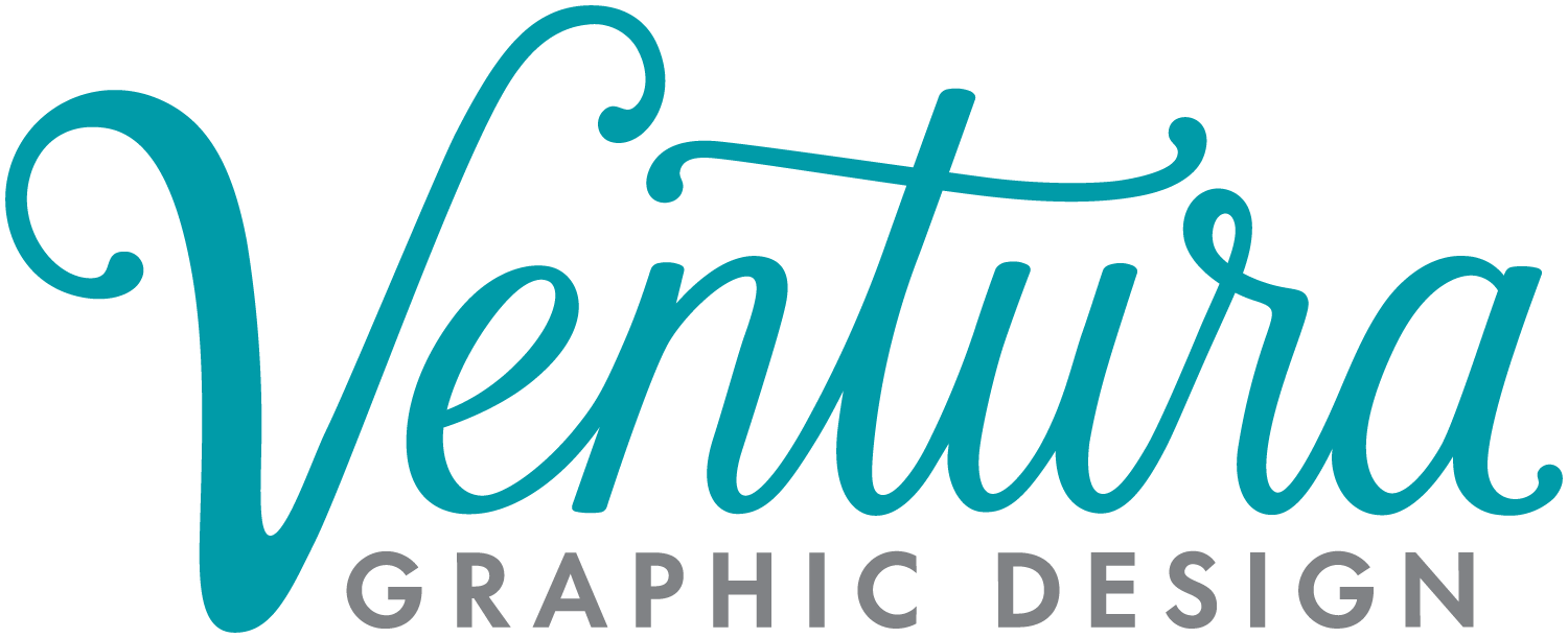
The first curve on the V is oddly squared off in the original. I smoothed it out to make a more natural curve.
In brush typography like this, and in traditional calligraphy, the upstrokes are thin and the downstrokes are thick. The transitions between the down and upstrokes on my letters were awkward and went too thin too quickly.
The r was a perfect opportunity to add a little bit of flair to the logo—an opportunity I missed in the first round. While you generally want all of your letters to be the same height, the loop in the lowercase r is a perfect chance to break out of that zone and add some dynamism.
The crossbar on the t was also a missed opportunity in my first design. Mirroring its relationship to the V and r in the new design ties everything together and gives it a reason for being there. My original crossbar had no meaning, it was just shaped and positioned that way because I thought it looked nice, now it completes the logo.
Why was the original logo angled? I didn’t have a reason for it, so I nixed it.
The e has always bothered me the most about the original logo. It was never right, and it sticks out like a sore thumb. This put some undue pressure on the new e and I tried a number of variations for it before settling on this one. I’m still not sure…
I’ve always liked the colors of my logo, but I was ready for something bolder. Turquoise is still my favorite color, so why not stick with that? Okay, I’ve given the exact opposite advice to my clients before (it’s not about what you like, it’s about what will work the best for your company)—but in this case I like to think it satisfies both.
Three different es I tried for the new logo.
My initial sketch of the new logo.
The final redesign!


