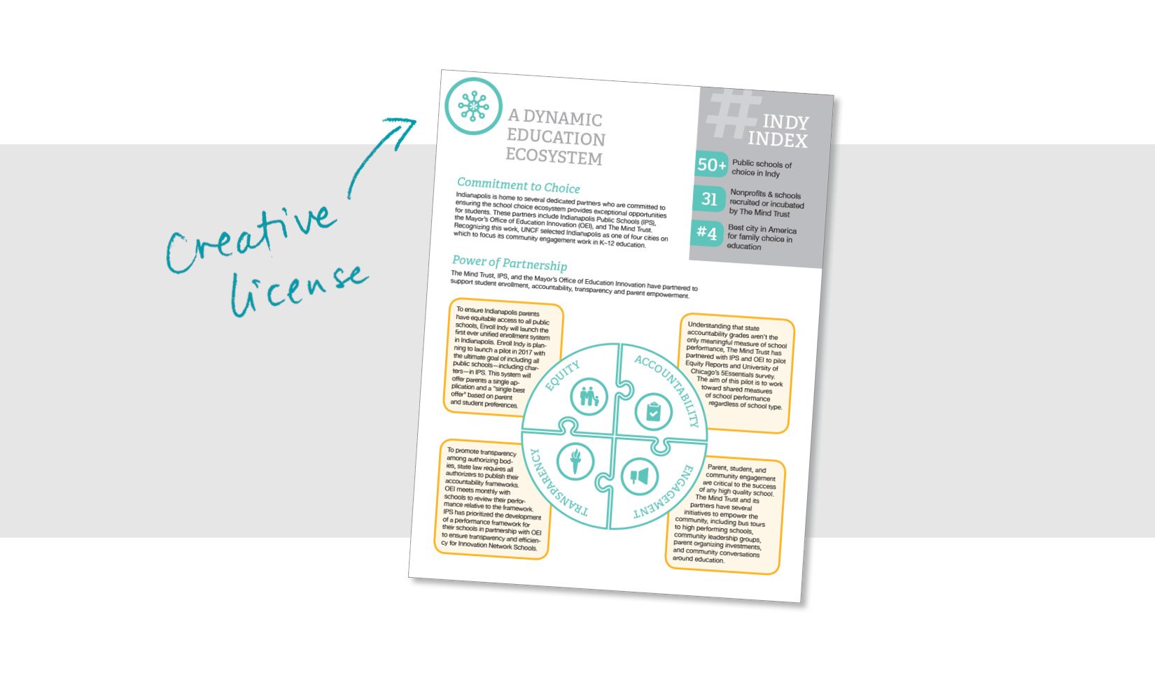
If you do some of your own design work— (I bet most of you do—and kudos! You’ve got this!) —let me alert you to the biggest mistake I see that immediately lets me know something wasn’t done by a professional.
It’s all about the margins!
I know! You’ve got so much content. And you’re trying to fit it all on one page. And the font can’t be too small. And you’ve got to include this photo. And you’ve got to have this graphic so it’s not just all text. But how is it all going to fit? We’ve got to fill the entire page!
And you can use the whole page. I’m not here to lecture you about white space! Just give it a half inch on each side. That’s all you need! Small margins are just fine (but no smaller than half an inch please).
Listen—nothing can go in that half inch. Keep it clean! And your document will look like it was done by a pro.
Yes, there are a few exceptions (aren’t there always?). These things are totally fine to be in the margin:
· Photos that bleed (go all the way to the edge).
· Boxes of color that bleed—but nothing IN the box should go into the margin!
· Minimal “creative license” items
If you feel like you have plenty of room, then increase your margins—go for ¾” or even a full inch. Just make them consistent and line everything up.
If you’ve got too much text, first try to cut it, and then… well, there are some tricks I know to get text to fit—but we’ll save those for another day.
Happy designing!


